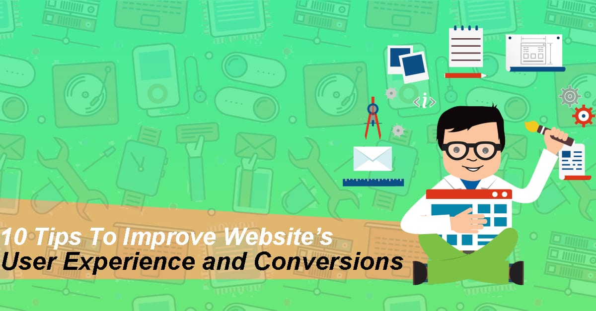
10 Tips To Improve Website’s User Experience and Conversions
Last updated on March 28th, 2024 at 6:58 am
A user experience that is unparalleled is the mainstay for the high ranking website. As the user experience optimally defines if you have noted a rise in your bounce rate or a rise in your conversion rates. The business and e-commerce ecosystem today, websites have appeared to be the most potent tool than another.
A website is a round-the-clock marketer, and so it has the competence to be your strength and the backbone for your marketing strategies. An increasing number of businesses are adapting to this tool to gain technical competence against their competitors, and they need to make their user experience the great. In this regards, a business must foster, acknowledge and help users as they come to its website, product, pattern, and presentation
Lessons from the experts demonstrate that for every penny, a business invests in enhancing the user experience, it earns 10 times and in cases 100 times leverage as well as gain customer contentment and loyalty
Understanding the user experience
Understanding the user experience
User experience is not just a view or response stimulating from the use of a product or service. However, the user experience is a complete package of brand image, the performance, process, design, use of ease and serviceable potentialities of a collaborative system, as well as the viewer perceptive and physical performance from the experience, expertise, and nature of a use
Well, it’s a real fact that the swiftly altering digital trends can create an old and outdated impression of your website. Though in rare instances a remodeling can be a paragon, depends on your economies and efficiencies that need to be invested in such a vast UX research plan.
Your website plays a pivotal role in your digital marketing push. Crafting a great website experience for users’ needs in-depth knowledge of challenges users go through now and then
We have come up, with a collection of 10 tips that may be highly assistive in enhancing your website’s user experience and conversions so that you can gain technical competence
More negative spaces;
White spaces are an essential feature that adds value to a great design these white spaces make your content more readable as well as facilitating the users to keep track of the elements placed by the text
Adding negative spaces surrounding the contents and main heads results to grab attention more, they make your website appears to be exposed, fresh and unique. If your brand earns sustainability with these, then it may assist you in translating that feeling to the user. The disadvantage of negative space one should be well aware of is that it consume a significant portion of space
If you plan to place a large amount of text at the high point that catches the user attention without going down the website, then having larger negative spaces might be interfering with some potential data. The expertise is to create a right balance between what is more significant to communicate at the header and compliment them with some negative space to enhance the relevant image and content
It is worth considering the excellent website of Apple that stands among one of the early birds making use of negative space on the website to grab the attention towards the particular product. Apple was one that redefined the norm for creating breathing room in their scheme. The Apple website is a perfect example of blending active and passive negative spaces to draw potential attention towards products and leading to useful information instantly
Boost your website responsiveness
The most overwhelming experience often users complain about is the downtime a page requires to load. Since the mobile devices have taken hold in the market, people access information from all over the globe from diverse mediums.
Either they browse to order their favorite cuisine or watch the series of their favorite TV show they demand the rapid results to the information they want to access. When the users are not satisfied they revert. Slower access is a devastating experience for the users and can be profoundly overwhelming. Since everyone is entirely occupied in their routine and none has the time to stay for the more extended hours
“A five seconds wait for the page to can lead to an increase of 20% bounce rate, and that’s alarming.”
To boost up your page speed, you must initiate with compacting all your images before the final release of them on your page. The larger size files can be one of the primary cause of lower speed on your page. The second best example for quickest load times across the word is Amazon with a load time of fewer than 10.5 seconds and a time to interact of 1.8 seconds and yet none questions that.
The call to action should be stimulating
The viewers are predominantly familiar with the specific visual hints to evaluate which data is useful for them. Call to actions which are clear with a particular word facilitate your website viewers, to effortlessly source what they desire in the expected place of theirs.
While you design specific functions for your website, you need to reconsider the color choices and the impact it can have on the human psychology. Different shades give rise to multiple unconscious messages, consider, what you want by your users to translate concerning confidence, familiarity, and intellect and make choice of the shades smartly
Another thing one should consider is the appropriate words you place for your push button. For better experience, these words should interpret a verb or an action that provokes the user to make a move. The appropriate words and psychological influences can be highly evaluated with the emotional empathy that word stimulates. No stimuli lead to no action. So your words need to be influencing, time subtle and action oriented
The diversity with hyperlink
When a link is added to any page of your website, it clearly states that you desire your user’s attention there, so you must assure the links are quite visible while one places even a glance. Highlighted texts and multicolored content grabs the readers’ attention and progresses his or her action towards the secure link random users consider, blue and underlined contents as a link and quickly click on it.
Taking advantage of users expectation and what their prior information about using the website is the synonym to success
When it’s the question of differentiating the hyperlink, you might not need to redefine the color wheel. Staying with the traditional color can be the best move. The quickest way to evaluate how useful your hyperlinks are is to haze and eliminate the color from the original design and then take note of how it stands out.
Once you are adding hyperlinks, do not need to consider the length of the term for the hyperlink. Bonus; the lengthy the link titles the higher ease to recognize them
Highlight information within lists
Listed information with printed circles helps users to quickly help them reach them all the information desire, your benefits, the solutions you can offer and best features of the product or rendered service all in a precise manner. This will depict your value proposition more potentially and facilitate your user to have all the data they wish for themselves. Moreover, you don’t need to take the customary practices with a plain circle
With thousands of options available, you can be the most creative with your listings and facilitate readers more with the infographics that highlight your points.
The urge to do this? As it allows you to narrow focus the pivotal points, you are enduring on bringing to light without using jargons and difficult terms
The exemplary website One.org makes use of the certain signs as the bullet listing points to bring to light their achievements in a manner that are eye-catching. You can also take note of the negative space around the icons that narrows focus on every point
Place the images smartly
Users are gaining more knowledge and are quicker concluding a website before browsing the website so far. Within the very first glance, they can point out instantly a generic stock image that they have already seen anywhere else, or that matches the generic style of stock photos. Making use of such images can question the confidence and also appears to be familiar and less appealing.
Regrettably, the negligence may spoil your brand image
You can quickly raise conversions on your website all by exchanging a stock photo by the real crew of best sellers. You can get a higher conversion and trust by adding an actual picture of your product comparative to the stock photo. Conclusively the stock images are higher in quality and resolution yet it may not be effective building trust and loyalty of a consumer towards a particular brand
Eventually, the stock photos would not serve to translate your value proposition, your brand story, products and services in the manner you have wished for.
Solely the real photograph of your best sellers can deliver the value while making a connection with your potential services.
Place your images in a certain pattern on your website that compliments the information facilitate users a good break from reading so long, yet you have to make sure the images you place are enough relevant and unique
The well-crafted typefaces and heading can make a huge difference.
Your text and relevant headings should carry what your potential consumers demand. Targeting relevant keywords in your heads is crucial to highlight your message and grab the attention of the potential viewers. Often search engines prefer to headings over other text hence making the heads smartly, and unique can potentially enhance your search results
Above all the smart headings lead users to your site, making it familiar to browse and extract content that makes a direct connection
A complimenting website is the most appealing.
Uniformity, explains to crafting things that complement each other. From title size to typography selection, push button classes, spaces, design, and style of illustration, image selection, the whole kit, and caboodle should be aligned to showcase your design rational throughout.
To have your audience experience the unparalleled as they browse through your website, it is crucial that they should feel living on your website. Inefficient design differing from a page and so can bring out an impression to go astray, overwhelm and lose loyalty towards your brand
Have I lost the page behind or is it the same link? I often ask myself when I come to experience websites that are not sustainable and undoubtedly end up losing confidence and switching to another
The social news site Reddit has been enjoying its prestige from past decades. From its establishments, a handful of variations have been made through it but at the end of the day the website showcase the similarity from the very first appearance in 2005 until today
Minor variations to enhance functionality and boost the user experience are always pleasing. However, radical and unexpected alterations to design can hesitate users. Consistency yonder is staying on similar pages and features. It may also showcase being steady with a redesign if you are already enjoying a good prestige
Identify 404 errors
As search engines may penalize you for 404s, page not found but a user may potentially. The browser clicks on the link or an image with a widespread expectation that it may take them to the next level they want to reach. An error page will upset your user and provokes to reconsider wasting their minutes on your website. Similar to poor load times, the appearance of 404 errors is quite overwhelming for a user, and it wholly spoils their experience of your website.
Make quick responses and be mobile welcoming.
Since technicalities have progressed to fulfill our needs to be social. Websites are the game players of this change. It makes a better impression if your website is mobile-welcoming and simpler to browse through irrespective of the device they are accessed. Lately, Google has implied penalties on the websites that are not mobile friendly, elevating the necessity to be responsive. This is the pivotal manner that can enhance your websites’ user experience and conversions
Final thoughts
Underprivileged user experience may lead to ineffective conversion rates. With fundamental bases for evaluating your website understanding your audience and urge to educate can resolve several challenges in the years ahead. Investments for enhancing your user experience and the consequences will be evident.
Authors’ Bio
Edward is Sr. Illustrator and Graphic Designer at Video Animation Studio. He excels creating timeless graphics, illustration and 3D animations that are simple whimsical and depicts life. His creativity can be seen all over the industry and his portfolio. He perfectly brings to life what one can imagine either people with expressions or animals with feelings.
Author Bio:
Dinesh Lakhwani 

Dinesh Lakhwani, the entrepreneurial brain behind “TechCommuters,” achieved big things in the tech world. He started the company to make smart and user-friendly tech solutions. Thanks to his sharp thinking, focus on quality and the motto of never giving up, TechCommuters became a top player in the industry. His commitment to excellence has propelled the company to a leading position in the industry.
Popular Post


Recent Post

SaaS Growth in 2022: Growth, Challenges, and Strategies
Software-as-a-Service (SaaS) is expanding very quickly in the entire IT business. SaaS models are the first preferences of many enterprises because of their flexibility, cost-effectiveness and subscription-based model. In the pandemic, companies required the cloud network; thus, SaaS has only got growth and will be growing. Gartner and BMC have given highly optimized reports, according […]
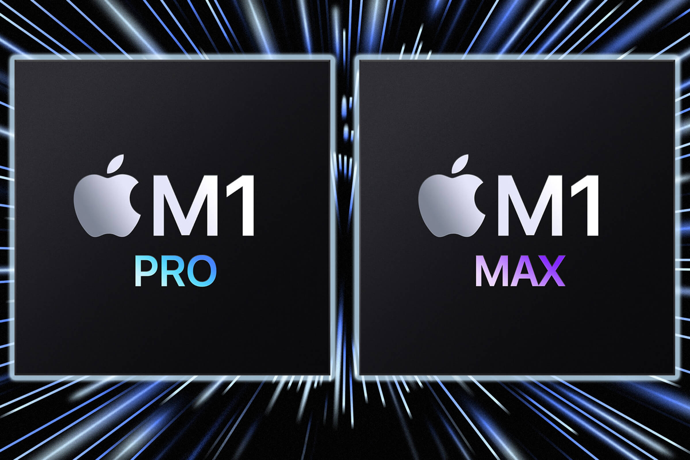
M1 Pro vs. M1 Max: Which Is The Better Mac Chip
In 2020, Apple’s M1 chip debuted and blew us all away with how much it improved performance and efficiency in the MacBook Air M1, Mac Mini M1, and MacBook Pro M1. Mac users were still on the M1 performance hangover when Apple launched M1 Pro and M1 Max with better performance promise. Both chips are […]

Apple Pay Not Working! Here’s How to Fix It (10 Fixes)
Today, people are more and more relying upon digital payments because they are safe and fast. But sometimes, when you have to make an urgent payment, and your Apple Pay is not working, there is nothing more frustrating than it. Apple Pay might have military-grade level security, but it is still prone to errors. However, […]

How to Fix WiFi Disappeared in Windows 11?
Users have complained that the WiFi symbol has disappeared from their taskbar after upgrading their PC to Windows 11. A network icon is present on the taskbar that displays network access. When your device doesn’t have the essential drivers installed, you will see an absent WiFi icon. Furthermore, if your computer’s WiFi adapter is deactivated […]
How to Fix Windows Update Service Not Running
The majority of Windows upgrades address security concerns. It is the most serious issue, as viruses or hackers might take advantage of them. Other flaws and concerns in Windows 10 can be resolved through updates. They may impact the sustainability of your OS, even if they are not accountable for security breaches. When you check […]

10 Best File Size Reducer Software in 2024
Digitization is one of the key driving factors for the success of modern businesses. However, it does have its limitations like storage and sharing. One of the main issues that global users are facing while managing online or digital data is the large file sizes. The effective management of size and storage by a leading file […]

How to Clone Windows 11 to SSD/HDD/USB Drive
Cloning or saving Windows 11 to an external device can be helpful. It helps users from being stuck in odd situations when there are some errors in the system and no backup. It can be done manually or using a dedicated software tool like the EaseUS Todo Backup tool. The free trial of this tool […]
How to Fix Windows 11 Search Bar Not Working?
The search bar on Windows 11 is one of the widely used features on any system. However, this utility is in-built disabled on Windows 11 system. Hence, users upgrading from Windows 10 to Windows 11 face the issue of using the search bar. Therefore, there is an immediate need for quick but effective solutions to […]

How to Fix Widgets not Working on Windows 11 (8 Solutions)
Windows 11 has brought many new and graphic-intense features for Microsoft users. Widgets is one of the best and most talked about Windows 11 features for both good and bad purposes. Windows 11 Widgets are extremely useful to access different information like weather, sports, photos, and news. In fact, Windows 11 has divided the Widgets […]
Gmail Not Syncing With Outlook (How To Fix)
When your company can utilize Microsoft products such as Outlook but also choose to use Gmail, there is no better option than to sync both. Are you facing difficulties in conducting Gmail and Outlook synchronization? Or, do you face the “Outlook 365 not syncing with Gmail” issue? You may experience difficulties synchronizing some or all […]